Website ReDesign
A UI/UX Design Case Study

Project overview

I led the end-to-end website re-design for the Stashfin platform, from early discovery to launch. The goal was to transform the website into a high-conversion digital channel that could drive business growth alongside the mobile app ecosystem - creating a secure, intuitive, and fast banking experience that encouraged users to explore, engage, and convert confidently on the web as well.


Project: Stashfin Website

Industry: Fintech / Digital Banking

Location: Gurugram, Haryana

My Role: Lead Designer

Timeline: 2 Month

Amount of screens: 60+ screens


Responsibilities

  • Leading the product design direction and UX strategy

  • Defining product vision and core user scenarios

  • UX research, competitive analysis, and insight synthesis

  • Information architecture and complex user flows design

  • Interaction design and UX logic validation

  • Ul design and visual system definition

  • Cross-platform design


Collaborated closely with product stakeholders to align business goals with user needs and ensure design decisions supported long-term product scalability.

Website ReDesign
A UI/UX Design Case Study


Project overview

I led the end-to-end website re-design for the Stashfin platform, from early discovery to launch. The goal was to transform the website into a high-conversion digital channel that could drive business growth alongside the mobile app ecosystem - creating a secure, intuitive, and fast banking experience that encouraged users to explore, engage, and convert confidently on the web as well.


Project: Stashfin Website

Industry: Fintech / Digital Banking

Location: Gurugram, Haryana

My Role: Lead Designer

Timeline: 2 Month

Amount of screens: 60+ screens


Responsibilities

  • Leading the product design direction and UX strategy

  • Defining product vision and core user scenarios

  • UX research, competitive analysis, and insight synthesis

  • Information architecture and complex user flows design

  • Interaction design and UX logic validation

  • Ul design and visual system definition

  • Cross-platform design


Collaborated closely with product stakeholders to align business goals with user needs and ensure design decisions supported long-term product scalability.

About Stashfin

Stashfin is a leading fintech platform revolutionizing credit access in India through a technology-driven, user-first approach. Leveraging advanced AI for credit scoring, risk assessment, and real-time decision-making, it delivers personalized and responsible lending solutions.


Since its inception, Stashfin has evolved into a full-stack financial services platform, serving a wide range of user needs across lending, insurance, bonds, payments, and commerce.

Fintech Market Landscape in India

India is witnessing rapid fintech adoption, fueled by widespread smartphone usage, affordable internet access, and the rise of UPI-driven digital payments. As consumers increasingly shift toward digital-first financial experiences, expectations from banking platforms have evolved beyond basic transactions.


Despite this growth, many financial platforms still focus primarily on payments and lending, offering fragmented user experiences with complex onboarding flows, low transparency, and limited financial guidance. These gaps often create trust barriers and reduce long-term user engagement with digital banking solutions.

Key Problems
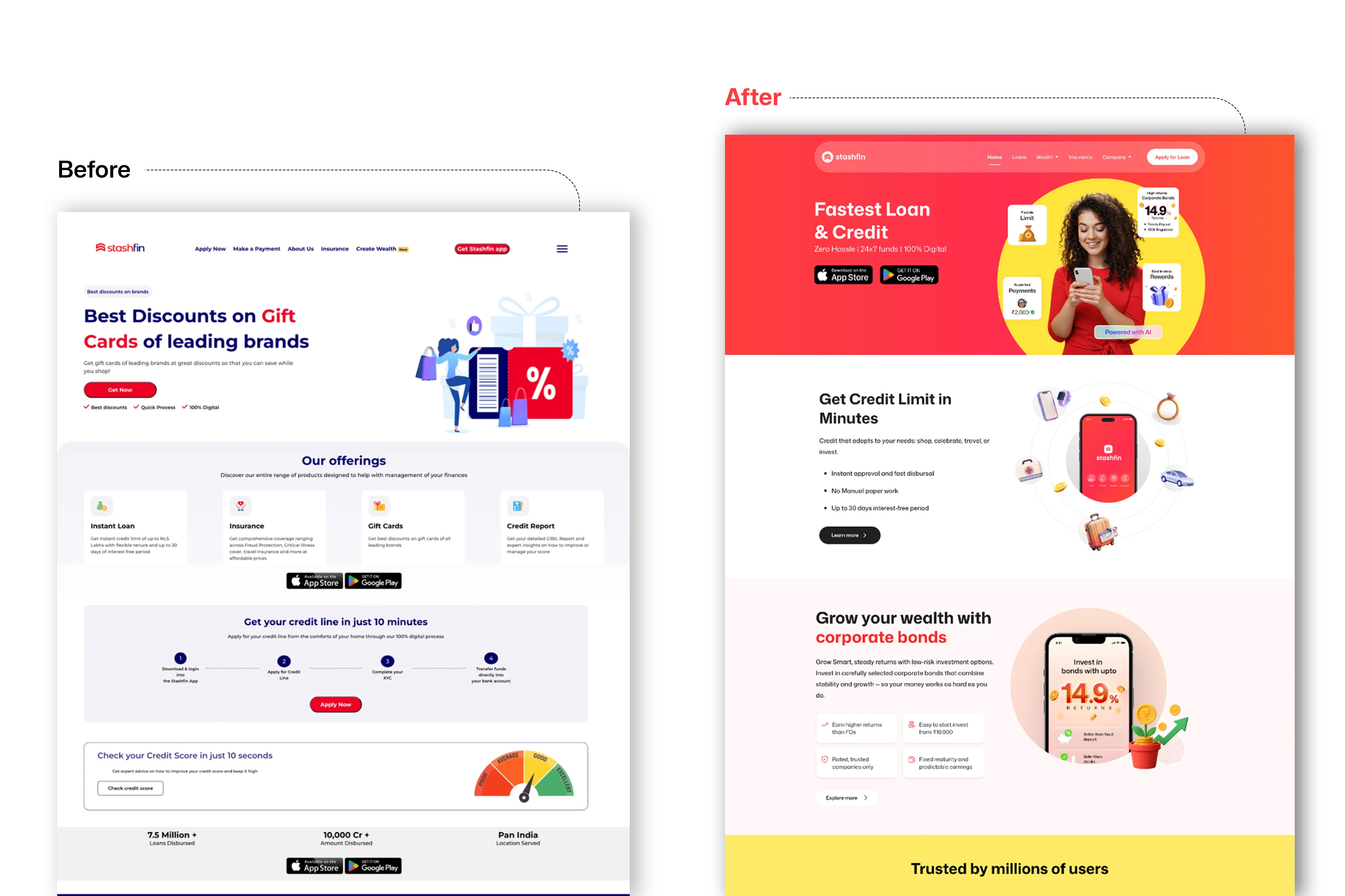
India is experiencing a fintech revolution, driven by UPI adoption, a young mobile-first population, and government digital infrastructure (Aadhaar, DigiLocker). Yet digital lending apps face a severe trust deficit - users are wary of predatory lenders, hidden fees, and data misuse. The website is often the primary credibility signal before a user downloads the app.

Despite strong underlying demand, many fintech websites in India are cluttered with legal disclaimers, buried CTAs, and weak social proof. Users leave before understanding the product. The redesign opportunity was to make Stashfin feel like a bank; reliable, transparent, modern - while retaining startup-speed energy.
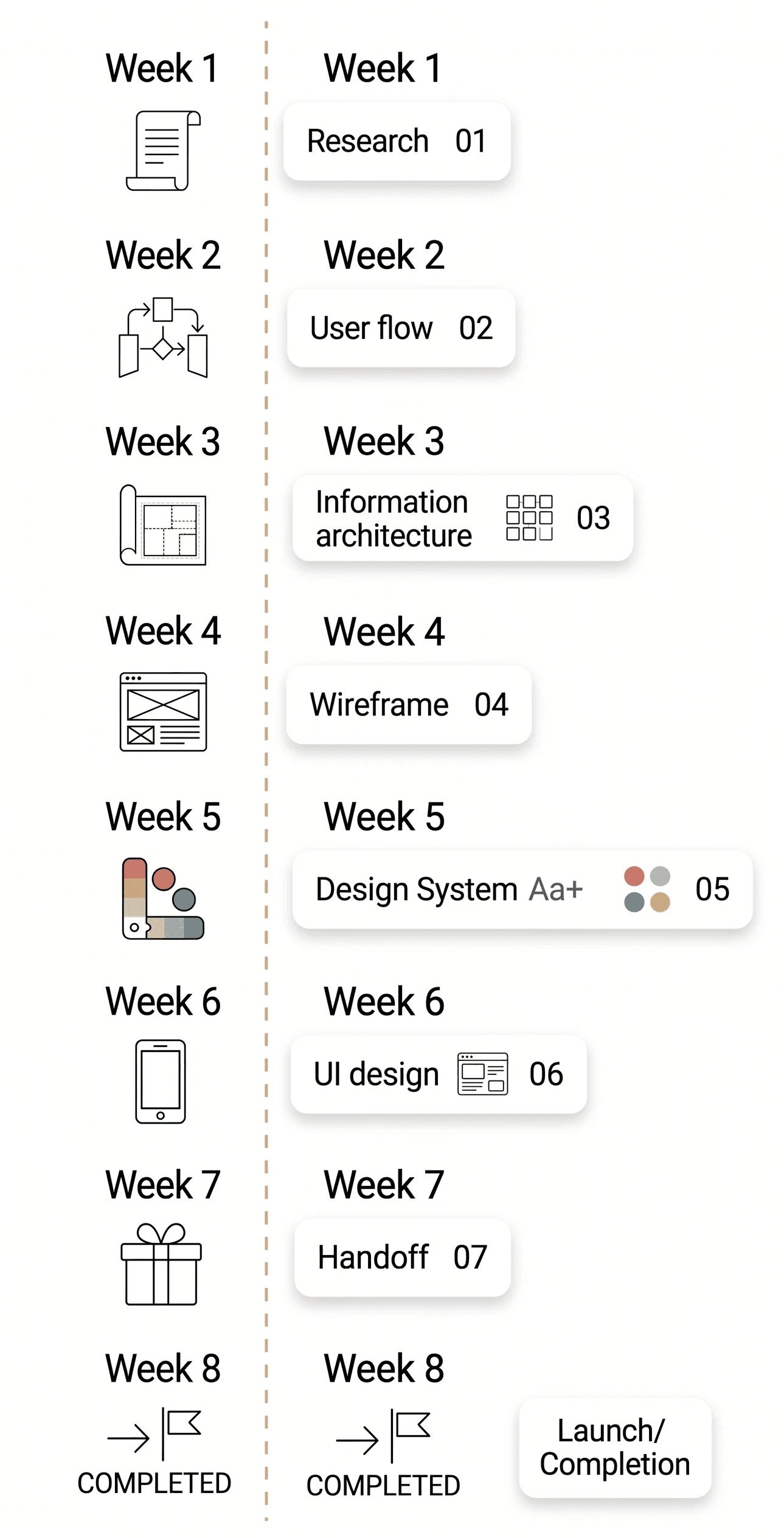
Complex onboarding

& KYC:

Account opening and identity verification remain slow, with an average process taking up to 15-20 minutes in some banks, discouraging new users.

Overloaded UX in traditional banking apps:

Cluttered interfaces lead to frequent errors in transfers and payments; ~40% of user complaints relate to confusing app flows.

Fragmented payment services:

Users rely on multiple apps for transfers, bill payments, and top-ups, resulting in poor retention and low engagement.

Low trust in new financial products:

Fraud cases, opaque antifraud systems, and unclear fees reduce adoption rates; only ~43% of transactions are digital.

Design process

"The process didn't end with pixels. After the Develop phase, I focused on Deliver (Weeks 8-9) by validating the design through usability testing and preparing a comprehensive Handoff for developers. This ensured the final code matched the design vision pixel-perfectly."

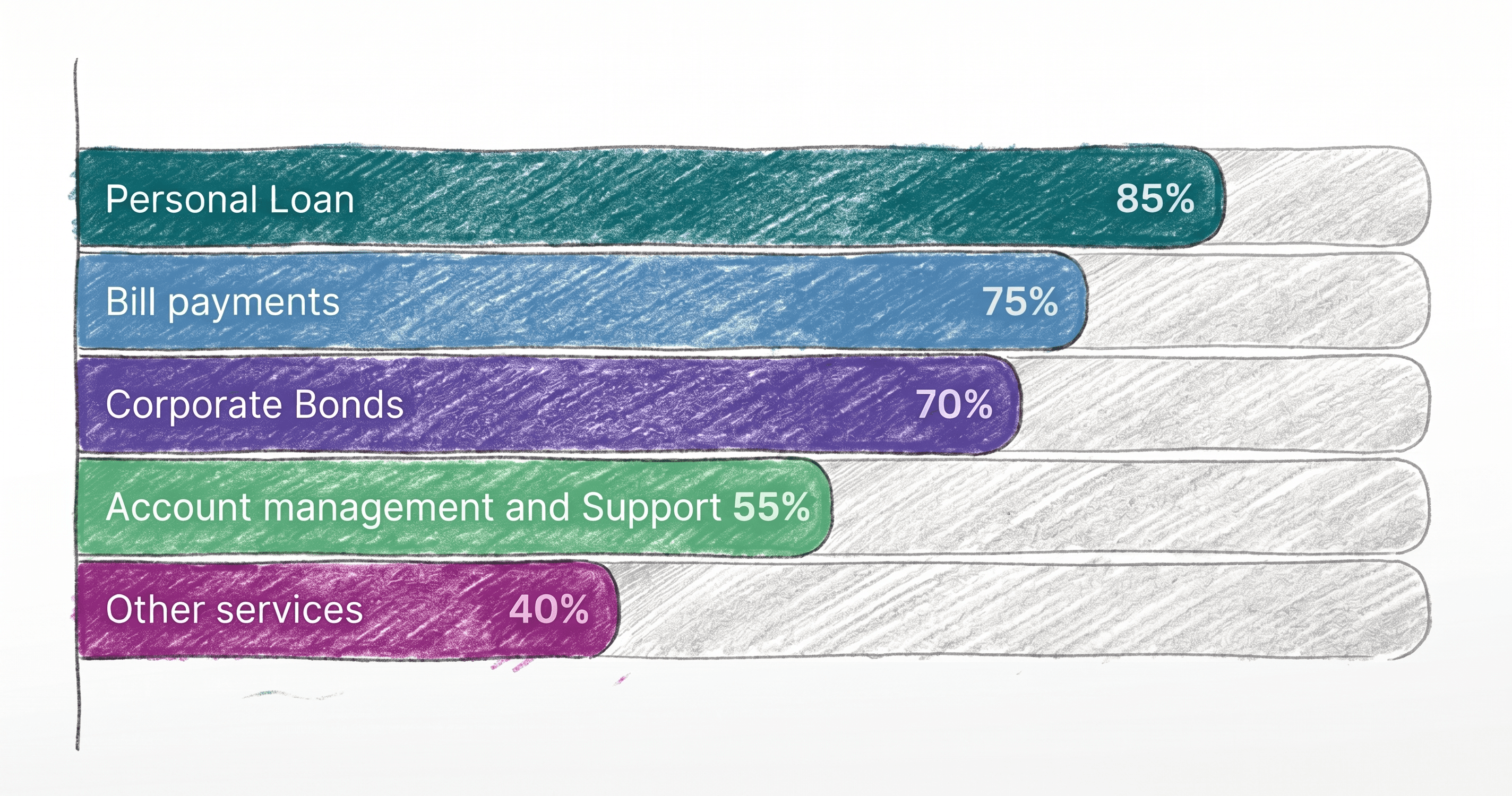
Most papular features

User research was conducted to identify the most frequently used features and understand everyday user behavior within mobile banking applications.


The insights helped prioritize core scenarios and focus the product experience around actions that deliver the highest value and frequency of use.
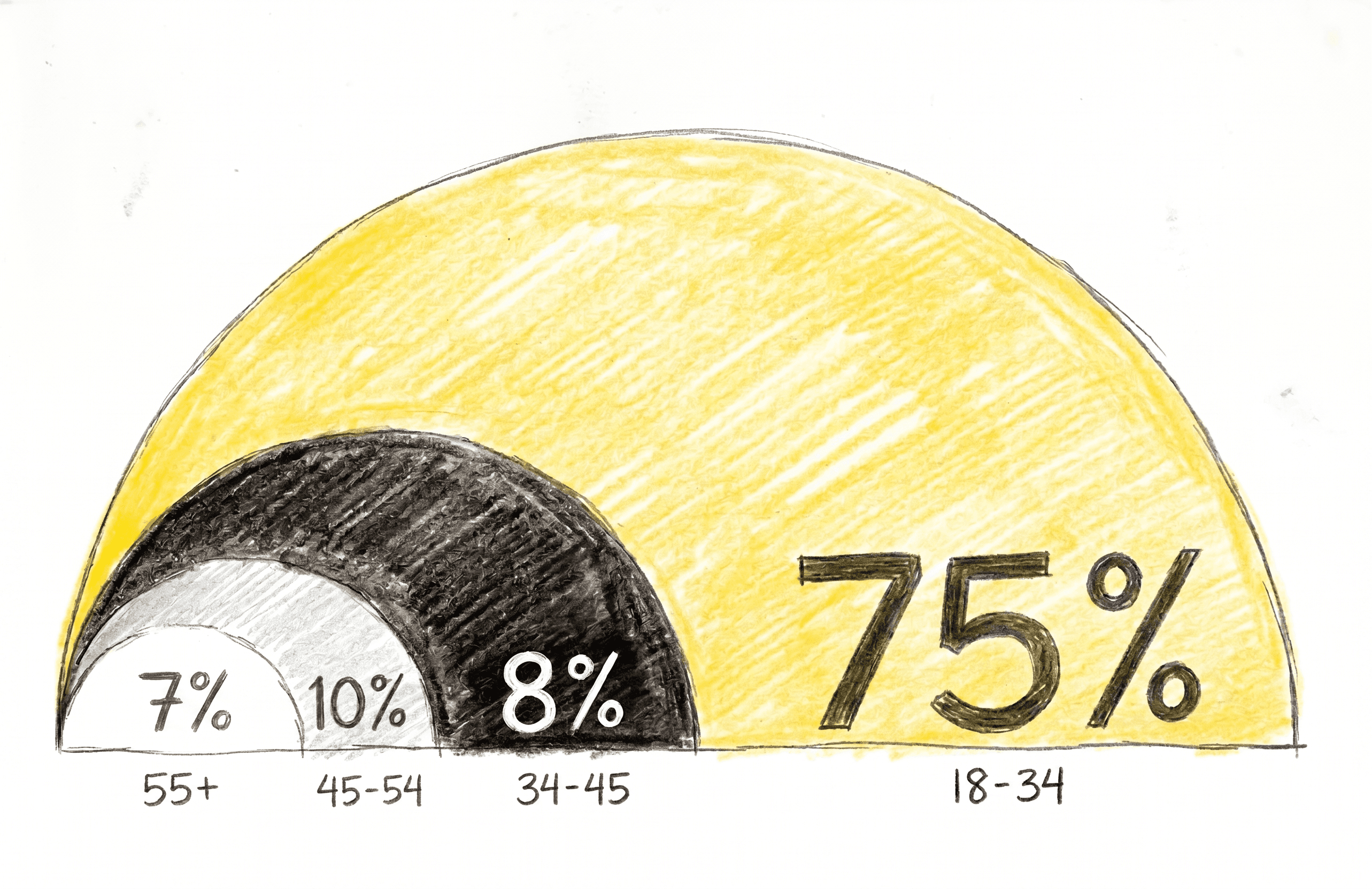
Key target audience

The primary target audience consists of digitally active users who rely on mobile banking for daily financial operations.


This group values speed, clarity, and control, and expects a seamless experience for payments, transfers, and card management without | unnecessary complexity.

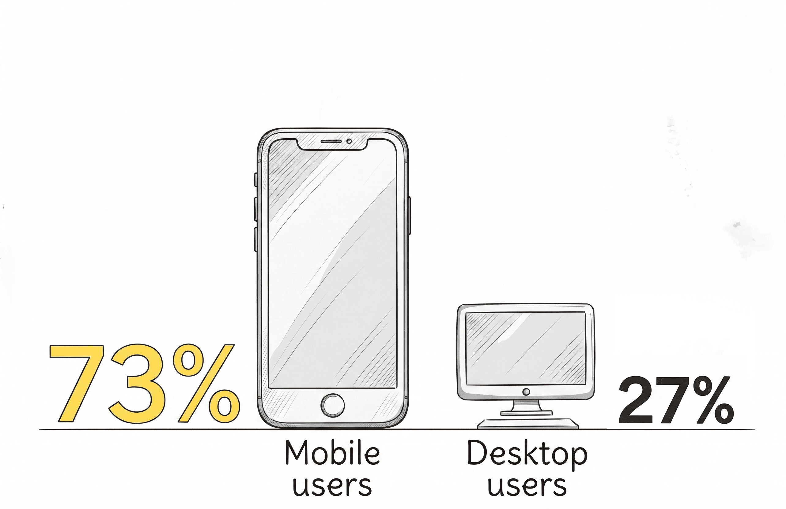
User platform insights

Website traffic analysis revealed that mobile users formed the majority of visitors on the Stashfin Platform.

This directly shaped the UX strategy by prioritizing:

  • Mobile responsiveness

  • Faster loading experiences

  • Thumb-friendly interactions

  • Streamlined content hierarchy

  • Conversion-focused mobile journeys

Rahul, 28 y.o.

Sales Executive, Pune

Rahul had an unexpected medical bill. He needs ₹40,000 quickly. He's heard of Stashfin from a colleague and lands on the website on his phone during lunch break. He has 5 minutes to decide if he trusts the product.

GOALS

  • Understand if he qualifies without a hard credit check

  • See the exact interest rate before applying

  • Apply and get a decision in under 10 minutes

  • JTBD: "When I have an emergency expense, I want instant credit with no branch visit."


PAIN POINTS

  • Doesn't trust sites that hide fees in fine print

  • Previous online lending app looked scammy

  • Confused by too many product options on one page

Priya, 32 y.o.

Marketing Manager, Bangalore

Priya wants to invest ₹2 lakhs in corporate bonds for better returns than FD. She's on Stashfin's website on desktop comparing options. She's detail-oriented, she'll read the whole page before deciding.

GOALS

  • Compare bond yield vs FD rates clearly

  • Understand lock-in periods and withdrawal rules

  • See credibility signals: RBI registration, audited returns

  • JTBD: "When I have idle savings, I want a safe, high-yield alternative to FD."


PAIN POINTS

  • Cluttered product pages that bury key figures

  • No clear comparison between investment products

  • Difficult to find regulatory and compliance information

User Personas

By analyzing user goals and financial behavior, we structured a website experience that remains transparent, reassuring, and fast; even on a 4G connection in Jaipur.

Rahul, 28 y.o.

Sales Executive, Pune

Rahul had an unexpected medical bill. He needs ₹40,000 quickly. He's heard of Stashfin from a colleague and lands on the website on his phone during lunch break. He has 5 minutes to decide if he trusts the product.

GOALS

  • Understand if he qualifies without a hard credit check

  • See the exact interest rate before applying

  • Apply and get a decision in under 10 minutes

  • JTBD: "When I have an emergency expense, I want instant credit with no branch visit."


PAIN POINTS

  • Doesn't trust sites that hide fees in fine print

  • Previous online lending app looked scammy

  • Confused by too many product options on one page

Priya, 32 y.o.

Marketing Manager, Bangalore

Priya wants to invest ₹2 lakhs in corporate bonds for better returns than FD. She's on Stashfin's website on desktop comparing options. She's detail-oriented, she'll read the whole page before deciding.

GOALS

  • Compare bond yield vs FD rates clearly

  • Understand lock-in periods and withdrawal rules

  • See credibility signals: RBI registration, audited returns

  • JTBD: "When I have idle savings, I want a safe, high-yield alternative to FD."


PAIN POINTS

  • Cluttered product pages that bury key figures

  • No clear comparison between investment products

  • Difficult to find regulatory and compliance information

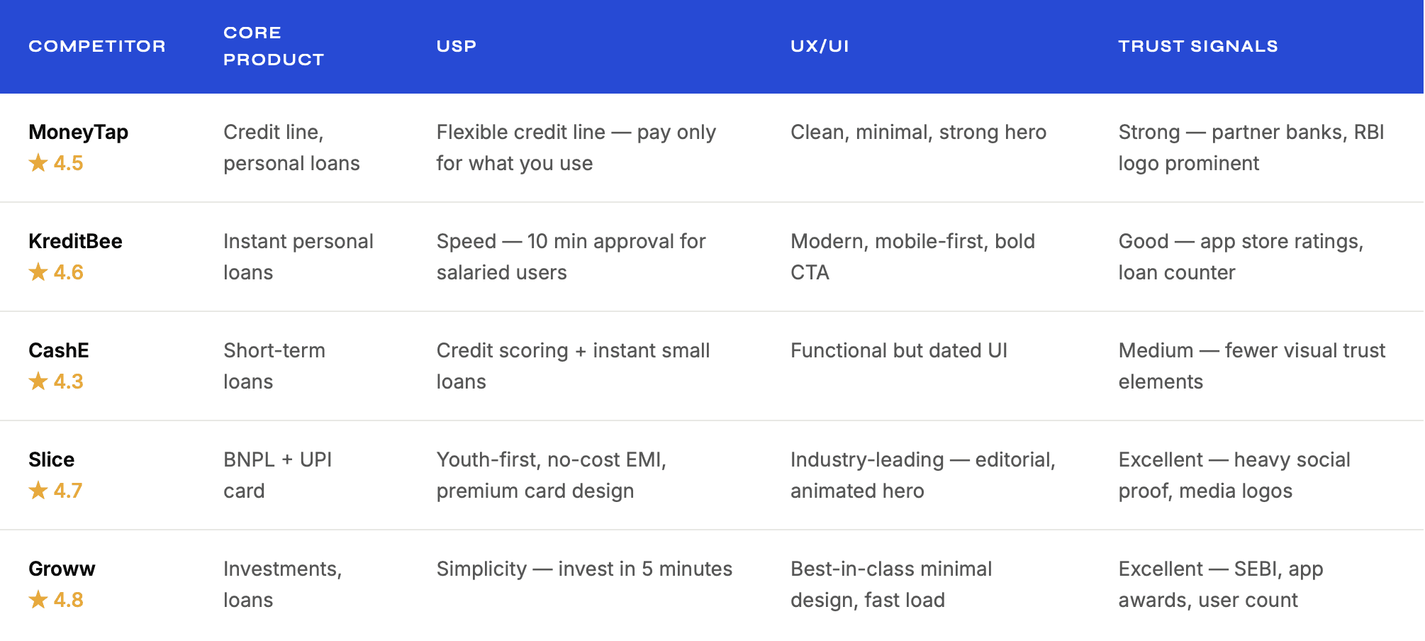
How Stashfin stacks up against India's fintech landscape

A deep competitive audit across 6 fintech platforms revealed clear patterns - the best performers lead with a single benefit, use social proof aggressively, and have frictionless mobile CTAs.

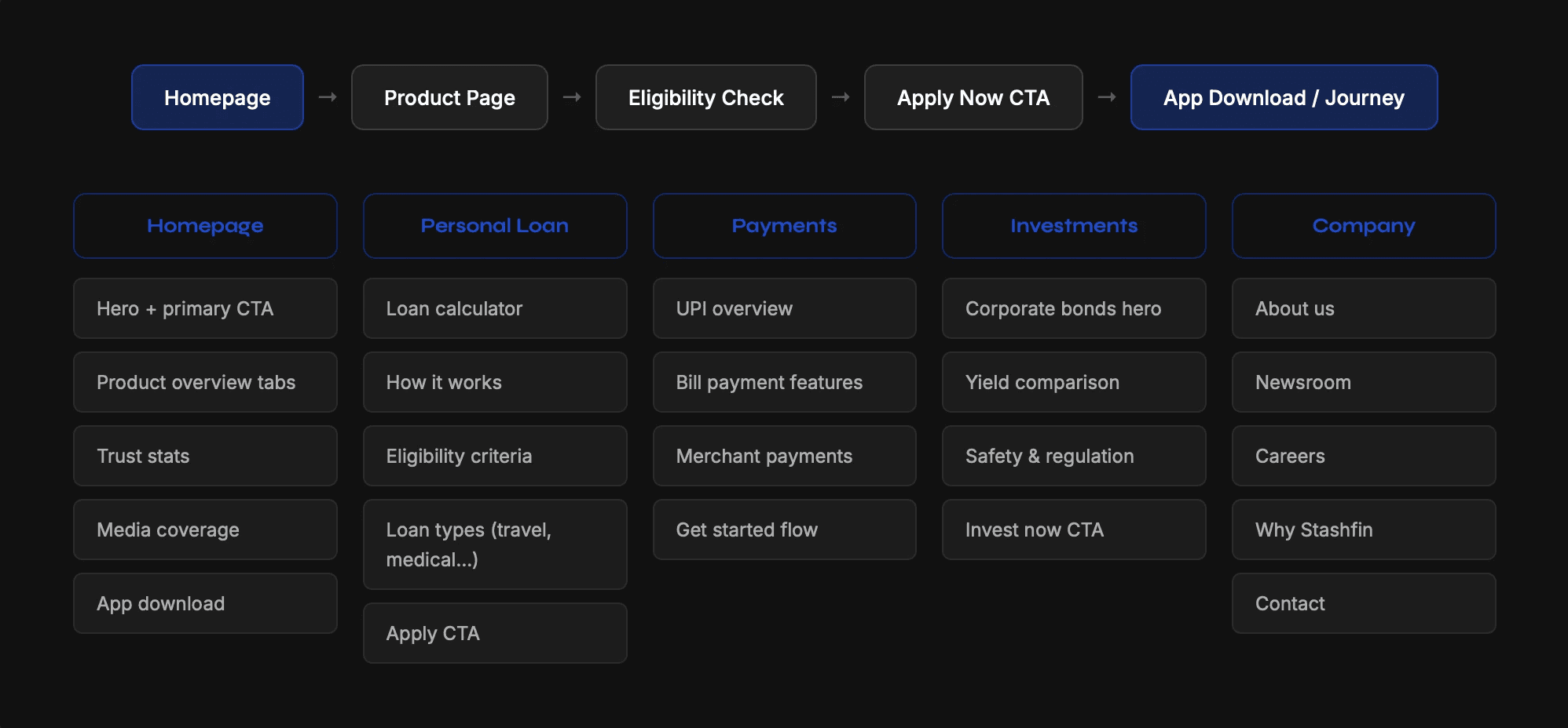
Website structure & user flow

Mapped the complete visitor journey from homepage landing through product discovery to loan application - identifying the key decision points that needed visual prioritisation.

Key Design Solution

1. Building Trust Within the First 5 Seconds

Many first-time borrowers hesitate before sharing personal information online. The redesign introduced immediate trust indicators above the fold to reduce anxiety and improve credibility perception.

Solution:

  • Added RBI compliance, app ratings, customer count, and loan disbursal stats directly below the hero section

  • Used a clean banking-inspired visual language with structured spacing and restrained color usage

  • Introduced media mentions, customer proof, and simplified FAQs across critical pages


Outcome: Users could quickly validate legitimacy before engaging with the application flow.

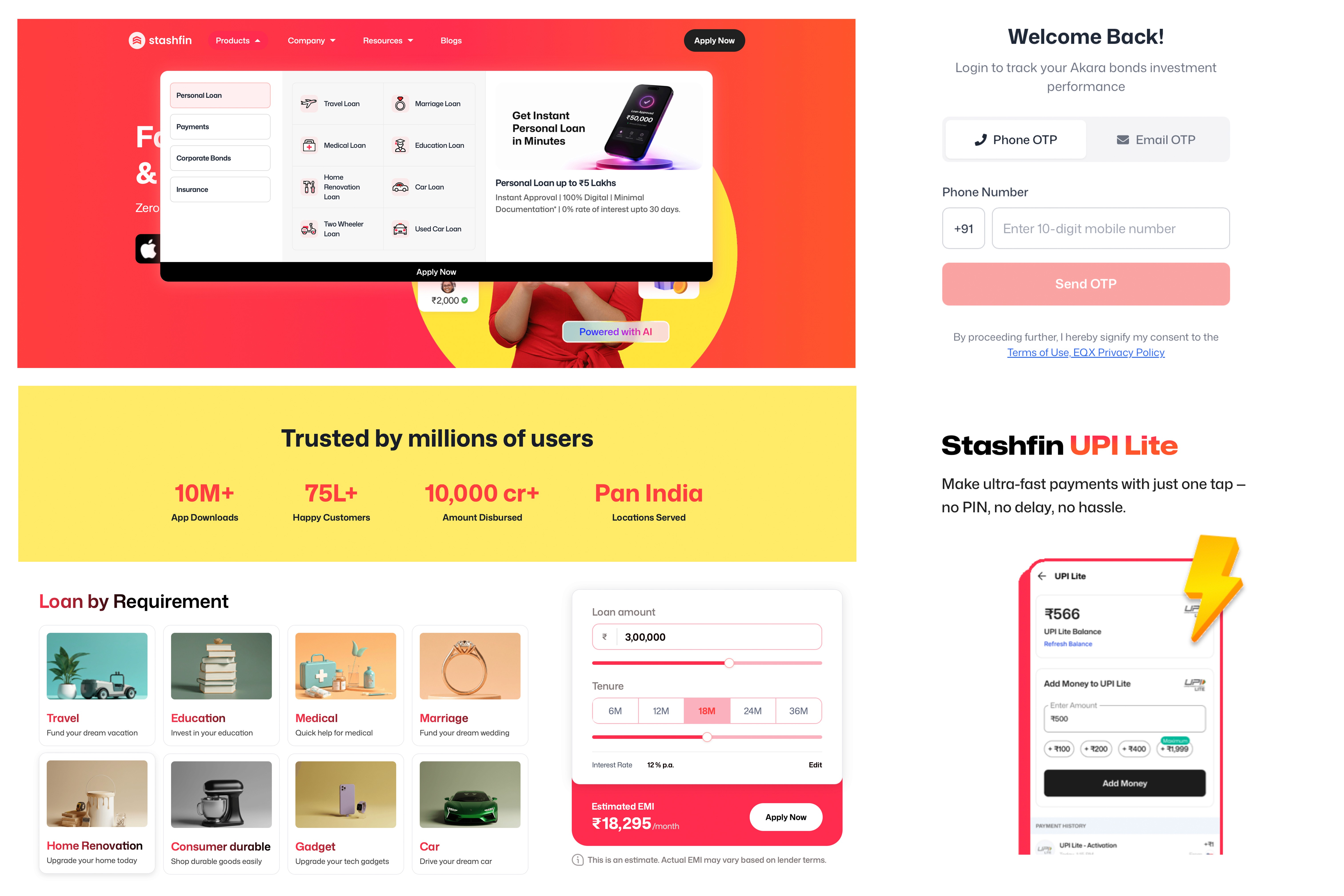
2. Simplifying Product Discovery

Stashfin offers multiple financial products - loans, UPI, insurance, and investments; which previously created cognitive overload for users landing on the homepage.

Solution:

  • Reorganized the information architecture into clear product categories

  • Introduced tab-based navigation for quick scanning

  • Created dedicated product sections with focused messaging and contextual CTAs

  • Reduced excessive text and replaced it with visual content blocks and step-by-step explanations


Outcome: Users could understand the ecosystem faster and navigate directly to their intent-based journey.

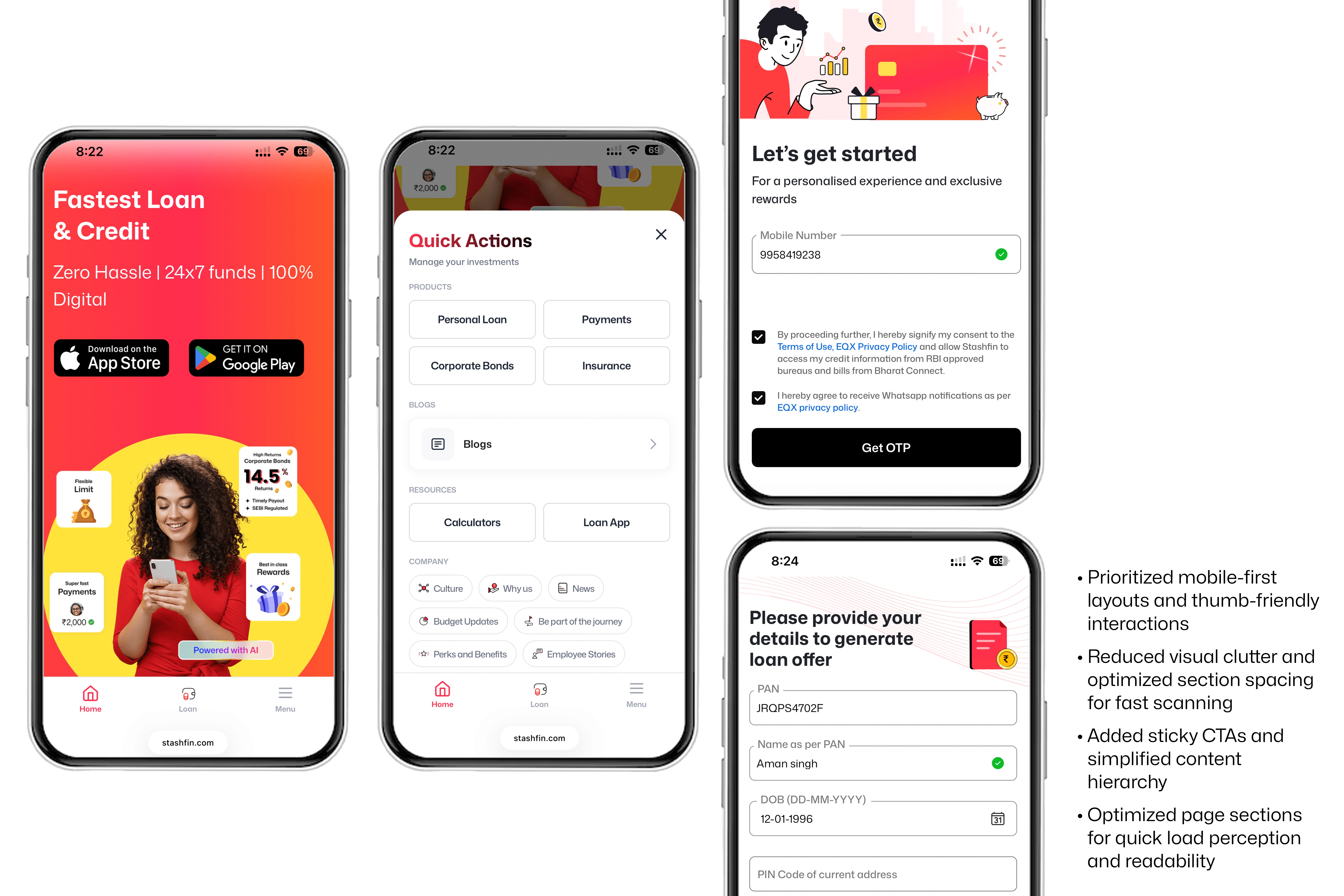
3. Designing for Mobile-First Behavior

Research showed that the majority of users accessed the website through mobile devices, often on slower internet connections and during short browsing sessions.

Solution:

  • Prioritized mobile-first layouts and thumb-friendly interactions

  • Reduced visual clutter and optimized section spacing for fast scanning

  • Added sticky CTAs and simplified content hierarchy

  • Optimized page sections for quick load perception and readability


Outcome: The experience became faster, easier to navigate, and more action-oriented for mobile users.

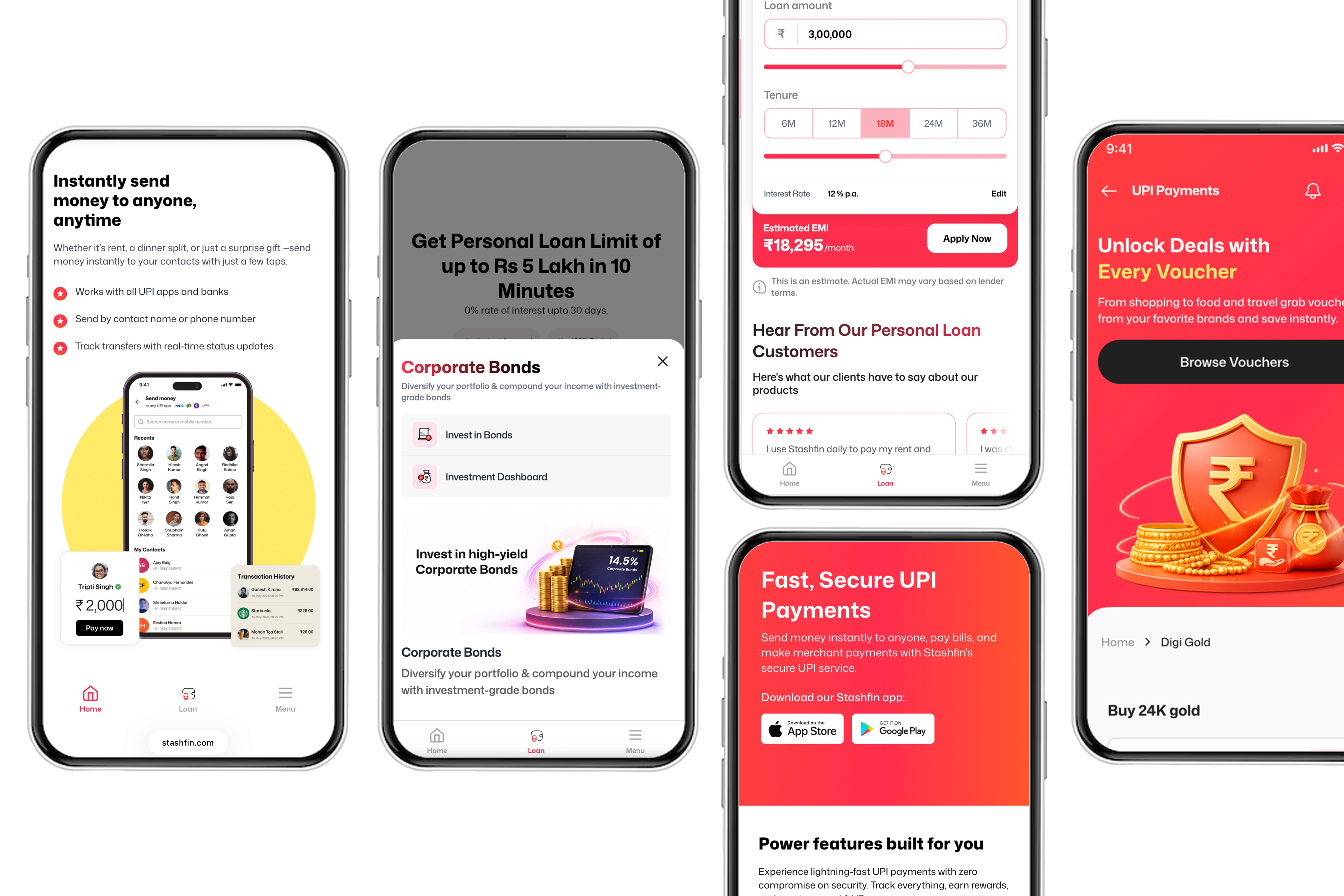
4. Increasing Conversion Confidence

Users were dropping off before application because they lacked clarity around eligibility, repayment, and interest calculations.

Solution:

  • Introduced an EMI calculator above the fold

  • Added eligibility indicators before application CTAs

  • Simplified “How it works” into a visual 3-step journey

  • Used plain language instead of banking-heavy terminology


Outcome: Users felt more informed and in control before starting the loan journey.

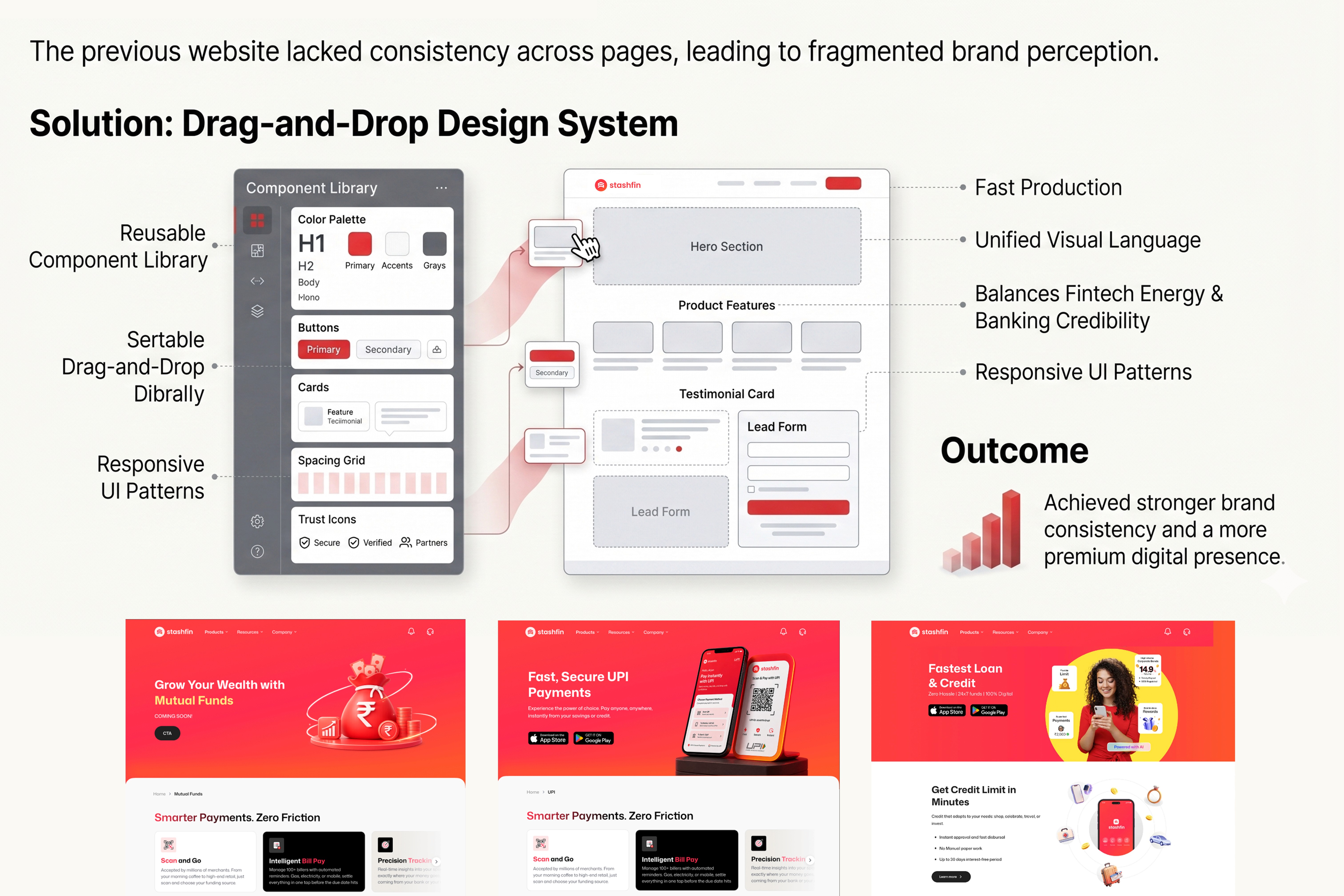
5. Creating a Scalable Visual System

The previous website lacked consistency across pages, leading to fragmented brand perception.

Solution:

  • Developed a reusable design system covering typography, color, spacing, buttons, cards, and trust components

  • Established a unified visual language balancing fintech energy with banking credibility

  • Created responsive UI patterns for future scalability across products


Outcome: The platform achieved stronger brand consistency and a more premium digital presence.


Business Impact

How better design translates to real business outcomes

By reducing friction in critical discovery flows and surfacing trust signals at the right moments, the redesign directly improved conversion rates and user confidence metrics.

Business Impact

How better design translates to real business outcomes

By reducing friction in critical discovery flows and surfacing trust signals at the right moments, the redesign directly improved conversion rates and user confidence metrics.

+42%

Increase in loan application starts


Moving the "Apply Now" CTA to the hero and adding the EMI calculator in the above-the-fold section significantly lowered hesitation. Users who interact with the calculator are 3× more likely to apply.

2.4×

Time on page - product pages


Contextual loan-type cards and the "How it works" step sequence kept users engaged. Restructuring the personal loan page into a discovery flow reduced the bounce rate substantially.

35%

Reduction in trust-related drop-off


Adding a persistent trust strip (RBI registration, customer count, app ratings) and a dedicated "Is this safe?" FAQ section reduced the proportion of users leaving at the point of data entry.

SEO-driven UX and content hierarchy helped the Personal Loan page rank in the
Page 1 Search Results for 2 consecutive months… and continue maintaining visibility.

Menu

SEO-driven UX and content hierarchy helped the Personal Loan page rank in the
Page 1 Search Results for 2 consecutive months… and continue maintaining visibility.